NEW LOOK COVER FOR MEW
TELL US WHAT YOU THINK
| Neil Wyatt | 06/07/2022 09:03:52 |
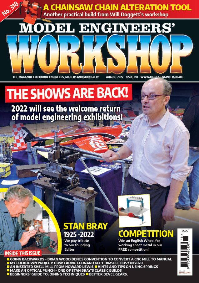
19226 forum posts 749 photos 86 articles | We're hard at work making Model Engineers' Workshop the best source for hobby engineers, makers and modellers in the business and WE NEED YOUR HELP! Have a look at the cover to our upcoming issue, No 318, Aug-22 issue. What do you think? What's good? What's bad? If you could choose anything, what would you like to see in pride of place on the front page? Any feedback on the cover to: [email protected] This issue is on-sale 22-Jul-22, pre-order from here.
Edited By Darren H on 06/07/2022 12:19:21 Edited By Darren H on 06/07/2022 12:20:18 |
| JasonB | 06/07/2022 09:24:48 |
25215 forum posts 3105 photos 1 articles | Maybe a few less balding and grey haired people on the covers would bring in a newer reader. 317s cover was not much good as the writing covered the only slightly technical bit with the clear area just showing someone's back and side, don't know if it was meant as click bait or just getting the female balance up to keep it WOKE. Would have been better to show someone in the background behind a 3D printer. As for 318, I think a few larger headings like the yellow ones would be better than the small stuff along the bottom, anyone picking it up in a newsagent will flick to the contents page to see that. You often don't see the lower half of the mags anyway when stacked in multi tear displays. |
| Kiwi Bloke | 06/07/2022 09:31:52 |
| 912 forum posts 3 photos | For me, the content is more important than the cover. There's currently rather a lot of evidence that more resources should be applied to editing, rather than fiddling with packaging. |
| Roderick Jenkins | 06/07/2022 09:33:00 |
2376 forum posts 800 photos | Looks a bit fussy to me. Glad to see that the main title is still supporting Ukraine Rod |
| Nick Wheeler | 06/07/2022 09:41:08 |
| 1227 forum posts 101 photos | It's a mess: too many horizontal lines breaking up the page. that's made even worse by the captions and pictures that aren't horizontal far too many extra words in tiny fonts that repeat the captions what is the picture supposed to show? It looks like I took it, and my photography is almost as bad as my singing english wheels are great machines, but why is he wearing one as a cod piece?
|
| JohnF | 06/07/2022 09:46:32 |
1243 forum posts 202 photos | The issue number [No 318 on the photo] use one colour set for all copies BUT a different colour for the copy that has the series index in thus its easy to find this copy from "the pile" -- say black type on yellow background. John |
| JasonB | 06/07/2022 09:48:35 |
25215 forum posts 3105 photos 1 articles | If you are trying to make it "the best source for hobby engineers, makers and modellers in the business" then reduce the Model Engineer and increase the other bit in size |
| Gary Wooding | 06/07/2022 09:51:47 |
| 1074 forum posts 290 photos | The cover content is fine for me: what I don't like is the high gloss finish. Its too slippery. |
| Ches Green UK | 06/07/2022 10:01:42 |
| 181 forum posts 7 photos | Neil, Most of the Comments above kinda hit the nail on the head....the cover is way too fussy, and there is no clear Content message(s). Very few magazines get this right. Have a go at Google'ling 'magazines' and look at the 'Images' results ... only a few of the Covers catch the eye and makes one curious about what is inside....the rest look like a bit of a dog's breakfast. And as Jason has neatly pointed out, the word 'Workshop' is way too dominant on the cover...it should be pushed back, a bit. All the above is meant as constructive ... I really appreciate the work you and the team do in readying the magazine. Ches
|
| Bazyle | 06/07/2022 10:37:03 |
6956 forum posts 229 photos | I think the small writing on contents at the bottom is usefull in two years when looking for that issue that had the optical punch. I have pointed out before that the cover picture is important real estate for showing a picture of a model or project that is covered inside - not to be wasted on pictures of people. The number tab at the top left is good for helping find a particular issue in a pile of magazines, so much better than a number in a tiny font somewhere in the clutter. It would be nice to put 'JUNE 22' next to it for when somebody tells you in five years that an item of interest was at a particular date, not knowing the issue number. |
| Graham Meek | 06/07/2022 10:47:49 |
| 714 forum posts 414 photos | Nice to see white writing on a black background. Red and Green writing over a photograph is not seen by me, and it plays havoc with my eyes, not to mention the Migraine this combination induces. Regards Gray,
|
| JA | 06/07/2022 10:54:45 |
1605 forum posts 83 photos | To me it does not matter what the cover looks like. It could be brown wrapping paper with the title pencilled on it. Surely the cover is eye candy, there to do only one thing, to catch the eye of the casual buyer and hook him or her. Considering the interests of this forum's membership I would reduce the emphasis on model engineering. JA Edited By JA on 06/07/2022 10:55:41 |
| Peter G. Shaw | 06/07/2022 11:10:01 |
1531 forum posts 44 photos | I think that on the whole it is too messy especially with the white lines separating the sections. The Issue Number looks too small compared with previous issues, possibly making it more difficult to read when quickly glancing through looking for a particular issue. I’m not sure that moving the Issue Date adjacent to the Issue Number is particularly helpful, but then if I’m searching for an article I always go by the Issue Number as this is how my home database is organised. I’m not sure that changing the relative sizes of “Model Engineer’s” and “Workshop” is really necessary. When all said and done, the magazine is not an alternative to “Model Engineer” and I think that having “Workshop” writ large helps to emphasize that point. Sorry Jason. On the same lines, I think the top line, (Strap Line?) was fine as it was as it helps to differentiate MEW from ME. Plus the actual text used emphasizes who it’s aimed at. To be honest, I’m a bit like Kiwi Bloke – I generally don’t look at the cover, other than the Issue Number, so it could theoretically be blank for me. As regards the young lady on Issue 317, well, is she young? How can you tell? But anyway, what’s wrong with it? I know historically the hobby has been the province of mainly elderly gentlemen, and we all know the reasons why, but why not have a few photos of the fairer sex? (Am I now in hot water for that phrase? Don’t care anyway.) Let’s show that workshop engineering is NOT the province of elderly men in dirty greasy overalls smelling of suds, or smoke, or whatever. On the other hand, maybe I’m just an old fuddy-duddy. Peter G. Shaw |
| Circlip | 06/07/2022 11:40:20 |
| 1723 forum posts | Cover and internal pages glossy cos the paper doesn't absorb the ink, easier to wash the paper pulp for recycling. You can still smudge the early MEWs. Regards Ian. |
| JasonB | 06/07/2022 11:41:46 |
25215 forum posts 3105 photos 1 articles | Posted by Ches Green UK on 06/07/2022 10:01:42:
And as Jason has neatly pointed out, the word 'Workshop' is way too dominant on the cover...it should be pushed back, a bit.
I am happy with the size of "workshop" it's who it is aimed at that I felt needed changing as "Model Engineers" dominates yet Neil said he is aiming at "hobby engineers, makers and modellers" so that should be larger
|
| Nicholas Farr | 06/07/2022 12:45:17 |
3988 forum posts 1799 photos | Hi, well no disrespects to anyone, but the shaping machine has more interest than the guy holding the handle, sorry! and I agree with JasonB's comments about 317 and about the yellow headings rather than the ones at the bottom. I also don't think the chainsaw heading should be before the magazines name and was better with the slogan about the magazine being for hobby engineers etc. I'm like Peter G. Shaw and think the issue number should remain the same size as it has been for a long time, there was an outcry about that not being there once and also just being a little number. Regards Nick. |
| Frances IoM | 06/07/2022 13:40:23 |
| 1395 forum posts 30 photos | I suspect I'm not alone in buying the magazine for the workshop/machine tool aspects and certainly prefer illustrations of such - I realise that young women in completely inappropriate costume 'draped' over motor bikes was the norm in the past but making even middle aged men the focal point of the cover detracts from my interest - just concentrate on the machine or the workshop. |
| Baz | 06/07/2022 13:50:12 |
| 1033 forum posts 2 photos | Don’t Morton’s Media employ graphic artists / designers, personally I think this is extracting the urine. |
| Nick Clarke 3 | 06/07/2022 13:58:26 |
1607 forum posts 69 photos | I now get MEW on subscription so this suggestion no longer applies to me but the magazine is usually on the bottom shelf at the back in those High St newsagents who stock it. Thus the title can't be at the top of the page or so low down so as to be hidden so it is good in the present position - but if one casts caution to the winds and kneels down, hoping that getting up again is a possibility, the headline above the title is about a chainsaw tool. i don't have a chainsaw so this would not persuade me to buy - and perhaps not even take the magazine out to read the rest of the front page as the only other visible item is that shows are back - and I knew that already. Whereas the Stan Bray obit, the competition or even 'In this issue' would all draw me in to read further so they would be good above the title. But as I say - I have a subscription now. |
| Andrew Tinsley | 06/07/2022 13:59:56 |
| 1817 forum posts 2 photos | I don't want to be a Luddite, but the "New Cover" does look an awful mess. Too many things trying to claim attention and too many human's about and not enough interesting machinery and product. The whole thing needs to be simplified AND carry a message as to what it is all about. Andrew. |
Please login to post a reply.
Want the latest issue of Model Engineer or Model Engineers' Workshop? Use our magazine locator links to find your nearest stockist!
Sign up to our newsletter and get a free digital issue.
You can unsubscribe at anytime. View our privacy policy at www.mortons.co.uk/privacy
- *Oct 2023: FORUM MIGRATION TIMELINE*
05/10/2023 07:57:11 - Making ER11 collet chuck
05/10/2023 07:56:24 - What did you do today? 2023
05/10/2023 07:25:01 - Orrery
05/10/2023 06:00:41 - Wera hand-tools
05/10/2023 05:47:07 - New member
05/10/2023 04:40:11 - Problems with external pot on at1 vfd
05/10/2023 00:06:32 - Drain plug
04/10/2023 23:36:17 - digi phase converter for 10 machines.....
04/10/2023 23:13:48 - Winter Storage Of Locomotives
04/10/2023 21:02:11 - More Latest Posts...
- View All Topics
- Reeves** - Rebuilt Royal Scot by Martin Evans
by John Broughton
£300.00 - BRITANNIA 5" GAUGE James Perrier
by Jon Seabright 1
£2,500.00 - Drill Grinder - for restoration
by Nigel Graham 2
£0.00 - WARCO WM18 MILLING MACHINE
by Alex Chudley
£1,200.00 - MYFORD SUPER 7 LATHE
by Alex Chudley
£2,000.00 - More "For Sale" Ads...
- D1-3 backplate
by Michael Horley
Price Not Specified - fixed steady for a Colchester bantam mark1 800
by George Jervis
Price Not Specified - lbsc pansy
by JACK SIDEBOTHAM
Price Not Specified - Pratt Burnerd multifit chuck key.
by Tim Riome
Price Not Specified - BANDSAW BLADE WELDER
by HUGH
Price Not Specified - More "Wanted" Ads...
Do you want to contact the Model Engineer and Model Engineers' Workshop team?
You can contact us by phone, mail or email about the magazines including becoming a contributor, submitting reader's letters or making queries about articles. You can also get in touch about this website, advertising or other general issues.
Click THIS LINK for full contact details.
For subscription issues please see THIS LINK.
Model Engineer Magazine
- Percival Marshall
- M.E. History
- LittleLEC
- M.E. Clock
ME Workshop
- An Adcock
- & Shipley
- Horizontal
- Mill
Subscribe Now
- Great savings
- Delivered to your door
Pre-order your copy!
- Delivered to your doorstep!
- Free UK delivery!








 Register
 Log-in


