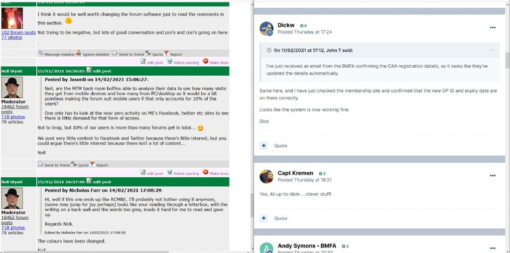
Plans for updating the archaic forum?
| Neil Wyatt | 15/02/2021 17:04:35 |
19226 forum posts 749 photos 86 articles | I thought I would compare this website and Model flying one side by side. I normally view this one at 130% zoom, so this is both sites at 130%, side by side but to be honest I think I would only need 120% with the modelflying one. I can't say I find the new style at all hard to read, and I think the pastel coloured bars are a lot less intrusive than the green ones here. Bear in mind th\t this image is reduced size... |
| JasonB | 15/02/2021 17:08:49 |
25215 forum posts 3105 photos 1 articles | It's not so much the pastle/green bars as the brighter background to the actual posts. Add the fact there seem to be a couple of blank lines at the end of each post and that just makes the "white" are even greater. If the actual post were the same light blue of the quoted text that would be a lot easier on the eye. Neil do you also loose the right column when zoomed in or have you cropped both images Edited By JasonB on 15/02/2021 17:09:03 |
| ega | 15/02/2021 17:40:47 |
| 2805 forum posts 219 photos | Posted by JasonB on 15/02/2021 17:08:49:
It's not so much the pastle/green bars as the brighter background to the actual posts. ... Would a browser "theme" mitigate the problem? |
| Emgee | 15/02/2021 17:41:09 |
| 2610 forum posts 312 photos | Comparing the 2 pages shown is a bit like chalk and cheese IMO. Emgee |
| Michael Gilligan | 15/02/2021 19:29:26 |
23121 forum posts 1360 photos | Posted by Neil Wyatt on 15/02/2021 17:04:35:
I thought I would compare this website and Model flying one side by side. I normally view this one at 130% zoom, so this is both sites at 130%, side by side but to be honest I think I would only need 120% with the modelflying one. I can't say I find the new style at all hard to read, and I think the pastel coloured bars are a lot less intrusive than the green ones here. Bear in mind th\t this image is reduced size... . Based on that comparison : (a) The subtle grey background is much easier on the eye, and (b) the ME/MEW site has a higher ‘signal to noise’ [content to wasted space] ratio, whilst remaining quite legible. I doubt my opinion will be of any consequence though: I’ve been one of many complaining about the stupid ‘auto-smiley’ things for years ... and they only needed to be switched off. MichaelG. |
| Roger Best | 15/02/2021 21:56:21 |
406 forum posts 56 photos |
I am an enthusiastic member of The Unofficial Mamod and Other Steam Forum, it used to be huge, then the host organisation decided to change and the owner (a volunteer not a company) decided to take the opportunity to modernise and migrate to another host. Result - huge number of threads where lost during the migration, promises (and contracts) broken. A large number of members dropped out, some because they didn't like the cosmetics, other offended that their careful work had been deleted, some to avoid the bitterness. Fortunately the community has some robust individuals and has survived and regained some strength but the migration was at great cost, especially the cost of the huge loss of information. This <CTRL>+<right click> is wonderful.
|
| Colin Heseltine | 15/02/2021 22:00:05 |
| 744 forum posts 375 photos | I've got to admit seeing them side by side I still prefer the current site layout. To my mind the two pages you have compared are not a very good comparison as the ME/MEW has lots of text and the flying one very little. My eyes prefer to see a distinct difference in text colour to the background (and preferably black text on white or pale background. I am yet another of the 40% of males who are colourblind. I remember many years ago going to a large meeting with over 150 people and we were being given a financial report. A lot of the graphs and figures were in smallish text and were red/green. I raised the point that many of us could not actually see/distinguish what was being shown. I have to admit whilst we have such a good website (whether or not it migrates) I do not see the need or use of a Facebook Page or Twitter a/c. Colin Edited By Colin Heseltine on 15/02/2021 22:02:17 |
| Peter Greene | 15/02/2021 22:32:04 |
| 865 forum posts 12 photos | Posted by Michael Gilligan on 15/02/2021 19:29:26:
Based on that comparison : (a) The subtle grey background is much easier on the eye, and (b) the ME/MEW site has a higher ‘signal to noise’ [content to wasted space] ratio, whilst remaining quite legible. I doubt my opinion will be of any consequence though: I’ve been one of many complaining about the stupid ‘auto-smiley’ things for years ... and they only needed to be switched off.
+1 (on all counts). |
| Nicholas Farr | 16/02/2021 07:46:31 |
3988 forum posts 1799 photos | Hi, yes those big brilliant white "letterbox's" as I call them, overwhelm the writing and is a strain on my eyes and some only have a few words in them, which make them worse, in my opinion. I have no problem with the green bars and they separate each post distinctively, which makes (for myself, that is) easy to follow the flow of the thread. I've no problem with updating things, but I think the basic layout and style as it is, should stay pretty much the same. I agree with MichaelG about the background of the posts, on here and his "[content to wasted space] ratio". Regards Nick. P.S. I have no problem about the adds and other info on the right hand side, which are convenient at various times, but are ignored for most of the time. Edited By Nicholas Farr on 16/02/2021 07:51:48 |
| John McNamara | 16/02/2021 08:26:12 |
1377 forum posts 133 photos | Hi All What concerns me is as shown in some of the examples shown in this thread the width of the left or right columns can dominate the available space, squeezing the hard to read small and pale text of the actual posts into a small space. If there is going to be changes a clearly defined need for each change must be documented taking the end users point of view and the commercial imperative into account. So who will get the job to "Fix" the program ? Edited By John McNamara on 16/02/2021 08:28:33 |
| Emgee | 16/02/2021 08:53:16 |
| 2610 forum posts 312 photos | As John says above "However the current font size and the grey background is easy to read. Please don't muck about with it without very careful testing with users." I agree 100% with every point in the statement. Emgee |
| Nick James | 16/02/2021 09:15:52 |
| 11 forum posts | Please! No changes. It's fine as it is. |
| Circlip | 16/02/2021 09:25:31 |
| 1723 forum posts | And still no post numbers. Regards Ian. |
| Nick Clarke 3 | 16/02/2021 11:12:26 |
1607 forum posts 69 photos | MichaelG's comment that this site is easier on the eye and John's about being easy to read quoted by Emmgee are not quite the same thing. Human vision depends upon contrast and so it is easier to distinguish items where there is high contrast - on a computer screen black on white or black on yellow are effective. However neither of these are particularly restful on the eyes as a high luminance (bright) colour scheme can be tiring to use. The answer is to maintain the contrast while lowering the brightness to an acceptable level. Unfortunately this is sometimes difficult to do as many LCD screens and laptops in particular control the brightness and contrast by adjusting the backlight rather than the image displayed, even though there may be controls labelled brightness and contrast. The current colour scheme attempts to address the issue of tiredness by reducing the brilliance of the background by changing its colour. This seems an effective and easy way forward until declining contrast sensitivity of the viewer becomes an issue due to age or visual conditions. If you find the brightness of a site with black print on a white background difficult reduce the brightness rather than changing the background colour to grey which simultaneously reduces the contrast. On modern push button LCD monitors this can be a confusing wander through a number of menus but may need to be done as all of the LCD monitors I have come across seem to be set at 50% brilliance and 50% contrast out of the box and this is rarely the optimum once contrast sensitivity begins to decline after the age of 20 or so depending upon eye health. Vision and text is a complicated compound of different, sometimes contradicting issues and usually one aims only for the best compromise. Two examples - a 'thin' or 'lightweight' font like the one this site uses is harder to see, but the counters or 'holes' in letters like O B and D are easier to distinguish and c & e are easier to tell apart. So Bold is more difficult, but then so is the lightweight normal! Also making print larger may make it easier to see but less is taken in at a single glance so reading, and making sense of what has been read can become slower. The most important single piece of advice must be to take breaks from the screen. While outside the workplace the Display Screen Regulations are not policed, it is important to remember that they still offer excellent advice if you are using computers for extended times in the home. Nick Lead Teacher of ICT to Blind and Visually Impaired Students Qualified Teacher of the Visually impaired |
| Frances IoM | 16/02/2021 11:46:05 |
| 1395 forum posts 30 photos | Until this thread I had never realised the site used a grey background - I overrode all site defined colours in favour of my own including text font - by using the brightness on the laptop display (a simple control in Linux) I have had comfortable viewing with my old eyes for years - as I've pointed out before the original HTML standard which assume full user selection was prostituted by commercial interests Edited By Frances IoM on 16/02/2021 11:46:37 |
| JA | 16/02/2021 12:28:44 |
1605 forum posts 83 photos | I have been trying to follow this posting over the few months. It started as a suggestion that this website format was outdated and not fit for purpose. After a dormant period it was pointed out that a sister website had a new format which was work in progress and the first viewings were disappointing. The thread then seemed to have decended into chaos with a lot of contributors believing that this website will follow RCM&E's site. This believe has been helped by the apparent lack of denial that this will happen from any of those that run the forum. A simple question: Are there plans to redesign this website in the near future? JA
|
| Peter Greene | 16/02/2021 15:29:54 |
| 865 forum posts 12 photos | JA, you are in the same position I was a few days ago. Check out Neil's post on 11/11/2020 @ 10:53:32 ((Page 4 of this thread) when I think it will become clear. |
| Neil Wyatt | 16/02/2021 15:32:43 |
19226 forum posts 749 photos 86 articles | Interesting that people prefer the lower contrast black on grey to black on white, yet earlier others were complaining the previous iteration of the RCME site had too little contrast. It seems these things are easily reconfigurable, I anticipate that we will try some initial settings and get feedback before making changes. When this happens I hope people will appreciate it may take a few iterations to get the optimum result and bear in mind that what suits one may not suit all. If we can find a scheme that everyone can live with and most like, that will be a good result. Neil |
| Neil Wyatt | 16/02/2021 15:43:09 |
19226 forum posts 749 photos 86 articles | Posted by JA on 16/02/2021 12:28:44:
I have been trying to follow this posting over the few months. It started as a suggestion that this website format was outdated and not fit for purpose. After a dormant period it was pointed out that a sister website had a new format which was work in progress and the first viewings were disappointing. The thread then seemed to have decended into chaos with a lot of contributors believing that this website will follow RCM&E's site. This believe has been helped by the apparent lack of denial that this will happen from any of those that run the forum. A simple question: Are there plans to redesign this website in the near future? JA
Yes, what was a long-wished for change demanded by many forum members is soon to be put into action. Not unsurprisingly some others are worried about changes. The truth is that this forum software is not sustainable. Just like the archive having to move from Flash to HTML5, it's inevitable that we have to move to a new platform just to keep things going. The patching up of the forum software is near the limit of what is possible. The biggest changes will be to finding your way around, and this will take a little while to get used to. Once you have become used to viewing a personalised 'content I have posted in' page with links to the latest unread posts I am sure all will like this feature. Equally, a 'latest content' page that also lets you do the same for threads you are following but haven't commented on. Someone mentioned 'still no comment numbers', well actually there will be, revealed by a 'share' button that allows you to copy a link direct to any comment. Much improved quoting, including the facility to 'collect' several quotes from different people/threads and paste them into one comment. Neil
|
| Frances IoM | 16/02/2021 15:55:31 |
| 1395 forum posts 30 photos | "When this happens I hope people will appreciate it may take a few iterations to get the optimum result and bear in mind that what suits one may not suit all." and that was entirely the reason that the original HTML allowed the individual user to alter the presentation format. |
Please login to post a reply.
Want the latest issue of Model Engineer or Model Engineers' Workshop? Use our magazine locator links to find your nearest stockist!
Sign up to our newsletter and get a free digital issue.
You can unsubscribe at anytime. View our privacy policy at www.mortons.co.uk/privacy
- hemingway ball turner
04/07/2025 14:40:26 - *Oct 2023: FORUM MIGRATION TIMELINE*
05/10/2023 07:57:11 - Making ER11 collet chuck
05/10/2023 07:56:24 - What did you do today? 2023
05/10/2023 07:25:01 - Orrery
05/10/2023 06:00:41 - Wera hand-tools
05/10/2023 05:47:07 - New member
05/10/2023 04:40:11 - Problems with external pot on at1 vfd
05/10/2023 00:06:32 - Drain plug
04/10/2023 23:36:17 - digi phase converter for 10 machines.....
04/10/2023 23:13:48 - More Latest Posts...
- View All Topics
- Reeves** - Rebuilt Royal Scot by Martin Evans
by John Broughton
£300.00 - BRITANNIA 5" GAUGE James Perrier
by Jon Seabright 1
£2,500.00 - Drill Grinder - for restoration
by Nigel Graham 2
£0.00 - WARCO WM18 MILLING MACHINE
by Alex Chudley
£1,200.00 - MYFORD SUPER 7 LATHE
by Alex Chudley
£2,000.00 - More "For Sale" Ads...
- D1-3 backplate
by Michael Horley
Price Not Specified - fixed steady for a Colchester bantam mark1 800
by George Jervis
Price Not Specified - lbsc pansy
by JACK SIDEBOTHAM
Price Not Specified - Pratt Burnerd multifit chuck key.
by Tim Riome
Price Not Specified - BANDSAW BLADE WELDER
by HUGH
Price Not Specified - More "Wanted" Ads...
Do you want to contact the Model Engineer and Model Engineers' Workshop team?
You can contact us by phone, mail or email about the magazines including becoming a contributor, submitting reader's letters or making queries about articles. You can also get in touch about this website, advertising or other general issues.
Click THIS LINK for full contact details.
For subscription issues please see THIS LINK.
Model Engineer Magazine
- Percival Marshall
- M.E. History
- LittleLEC
- M.E. Clock
ME Workshop
- An Adcock
- & Shipley
- Horizontal
- Mill
Subscribe Now
- Great savings
- Delivered to your door
Pre-order your copy!
- Delivered to your doorstep!
- Free UK delivery!


 Register
 Log-in


