Forum sponsored by:

Hieroglyphics on a Wehlen & Co clock face
Can anyone identify the markings?
| Sam Stones | 09/08/2019 00:11:00 |
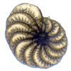
 922 forum posts 332 photos | I may have asked this before, but can anyone identify the faint markings about the name of this clock? Thanking you in anticipation.
By the way, that's not my soldering, although back in the 70's I did glue the marble case back together. Not as good a job as Kirsten or Steve of 'Repair Shop' might have done. Sam |
| Bill Phinn | 09/08/2019 02:26:37 |
| 1076 forum posts 129 photos | Is it possible it's just rubricated (and now somewhat faded) flourishing over the letters, i.e. solely decorative? |
| Michael Gilligan | 09/08/2019 07:27:48 |
 23121 forum posts 1360 photos | Posted by Sam Stones on 09/08/2019 00:11:00:
I may have asked this before, but can anyone identify the faint markings about the name of this clock?
.
. I thought it looked familiar, Sam ... Just looked back through my eMails, and found that we discussed it in April 2017 I failed you then, and thus far continue to do so MichaelG. |
| SillyOldDuffer | 09/08/2019 08:48:32 |
| 10668 forum posts 2415 photos | Just a suggestion, but might they have been put on by the dial painter to identify his work? Stone blocks in old ashlar walls often carry mysterious masons marks, partly for posterity, partly for payment, and this may be a feature of old clocks with hand made dials. (Did clockmakers make their own dials or buy them in from specialists?) The three horizontal lines above each character look decorative, but the symbols underneath may be Hebrew or Yiddish written sideways, possibly spelling out the painters initials. Fr P Wehlen implies to me the clock may be French, Fr being the abbreviation of Freres, ie Brothers. If the dial is continental the symbols may not be obvious to us Brits. Dave
|
| Former Member | 09/08/2019 09:24:28 |
| 1329 forum posts | [This posting has been removed] |
| Brian H | 09/08/2019 10:11:46 |
 2312 forum posts 112 photos | Many clocks and watches were made for the Turkish market, could the marks be Turkish (although I don't know how you would find out). Brian |
| Nick Thorpe | 09/08/2019 11:22:39 |
| 53 forum posts 6 photos | Deleted Edited By Nick Thorpe on 09/08/2019 11:26:29 |
| Brian H | 09/08/2019 12:51:43 |
2312 forum posts 112 photos | Posted by Brian H on 09/08/2019 10:11:46:
Many clocks and watches were made for the Turkish market, could the marks be Turkish (although I don't know how you would find out). Brian Just remembered; faces intended fr the Turkish market would have had the numerals marked with triangles so maybe the above is wide of the mark! Brian |
| AdrianR | 09/08/2019 12:54:13 |
| 613 forum posts 39 photos | Those symbols look so familiar, I am sure I have seen them before, just cant remember where. I have looked through astrology and elements none of those, very frustrating.
Adrian |
| Brian Sweeting | 09/08/2019 13:47:34 |
| 453 forum posts 1 photos | They look similar to printers typeface marks, if you look at some of those in the attached link they have the vertical line crossed with several horizontal ones. |
| old mart | 09/08/2019 13:53:44 |
| 4655 forum posts 304 photos | I know nothing about clocks, but those marks are familiar, spooky, isn't it. |
| Sam Stones | 10/08/2019 02:32:04 |
922 forum posts 332 photos | To get even closer to the hieroglyphics, I decided to use my Noveflex bellows and a macro lens (Canon EF100mm f/2.8 USM). Just for fun I turned on the camera flash for the first shot, and was presented with this ...
Paint contours !!! Having turned off the flash because the lens was throwing a shadow, I only discovered the contours upon opening the few files in Photoshop CS3. As for the real purpose of this thread, I'm still working through it. Meanwhile, thanks for all your replies. Sam Thanks Michael. I knew I'd tried before but my memory ain't what it used to be. |
| Sam Stones | 10/08/2019 02:40:49 |
922 forum posts 332 photos | Here are a couple of the other files via the bellows set up ...
The clock face is slightly spherical, and with limited DOF, focus isn't the best.
This last one suggests (to me), that the cross lines and serifs were either the originals, a guide, and/or the black lines were added later. Do the edges of the black lines suggest they were printed? I can't tell. Sam |
| Michael Gilligan | 10/08/2019 08:26:40 |
23121 forum posts 1360 photos | Posted by Sam Stones on 10/08/2019 02:40:49:
Here are a couple of the other files via the bellows set up ... [ ... ] The clock face is slightly spherical, and with limited DOF, focus isn't the best. [ ... ] This last one suggests (to me), that the cross lines and serifs were either the originals, a guide, and/or the black lines were added later. Do the edges of the black lines suggest they were printed? I can't tell. Sam . Excellent 'forensic' images, Sam The DOF could be increased [whilst maintaining high resolution] by stacking several images in 'Zerene' .... If you can produce the 'slices' I will happily stack them for you. MichaelG. Edited By Michael Gilligan on 10/08/2019 08:27:45 |
| Michael Gilligan | 10/08/2019 09:41:53 |
23121 forum posts 1360 photos | Posted by Sam Stones on 10/08/2019 02:40:49:
.
. I don't know what they are called, or whether they conform to a standard, but I'm almost certain that these marks are 'shorthand' to aid the painter when producing the 'signature' If I'm correct: The cross-bars indicate the height of the capital, and the curves indicate the width. Printers and Typographers use the terms en and em to describe widths ... note any similarity ? . MichaelG. Edited By Michael Gilligan on 10/08/2019 09:47:15 |
| Sam Stones | 11/08/2019 03:45:16 |
922 forum posts 332 photos | Phew! Who do I thank the most? Before I go on, I thought it worth mentioning, that other than the tiniest drop of (clock) oil where needed, the clock mechanism received no attention since I inherited it in December 1989. The marble case had been broken in several places, so I pulled that apart before gluing it back together. I can add nothing more as to its history. Thanks for your insight Bill (Phinn). Having never known or heard of rubrication, I thought it was a typo. The appearance of the characters suggests to me that the person who applied them was not particularly skilful, or applied the characters in a hurry. Then again the letter 'W' is little more than 2.5mm wide. Dave (SOD) - I like your ideas. A hint of graffiti perhaps? The paint has rubbed off at some stage, and what looks like Fr is actually a capital ‘G’. 34046 - Yes, I found it, thank you. The number of clock and watchmakers is overwhelming. Thanks Brian (H). Your comments and MichaelG’s ‘revelation’ as to the possible connection with ‘sign-writer’s shorthand’ both come very close to a solution. Nick - That’s a very helpful insight. I’m sure too, your book will be a valuable addition to anyone’s personal library. I’d love to find and read it. Meanwhile, I searched the public library catalogue, but it didn’t show. Could you guess an age for the clock please? AdrianR - Thanks for your efforts in searching those categories. Brian (S) - Thanks for throwing extra light on this challenge. I had a quick shufti through the symbol list of MS Word (>2800). There were tantalising similarities but nothing positive. Michael G - Many thanks for your ‘stacking’ offer. If only Photoshop CS3 would work. For several broad ranging reasons, I have contemplated buying Zerene or Helicon Focus but … I’ve entered into the process of downsizing most of my stuff, and unlikely to get there. Also Michael – I googled Signwriter Shorthand and found these … They are even more alluring than the MS Word list. Thanks again for your contributions. Best wishes, Sam Edited By Sam Stones on 11/08/2019 03:46:52 |
| SillyOldDuffer | 11/08/2019 08:24:16 |
| 10668 forum posts 2415 photos | Sorry to pour cold water on Signwriter Shorthand! Although the symbols look promising, don't they relate to signing as used by deaf people to communicate rather than sign writing as in shop facades and clock faces? They're a 20th century innovation unlikely to be on a 19th century clock. Like seeing castles in the flames there's always danger of joining the dots wrongly, so I'm not convinced my Hebrew suggestion is right either. Note how I mistook 'G' for 'Fr'! However they do resemble the characters Alef, Kaf, Yod, Pay and Bet turned by 90°. One character is too damaged to guess. First right way up, then turned as on the clock:
Any Hebrew scholars out there? Dave Edited By SillyOldDuffer on 11/08/2019 08:24:48 |
| Michael Gilligan | 11/08/2019 08:36:31 |
23121 forum posts 1360 photos | Posted by SillyOldDuffer on 11/08/2019 08:24:16:
Sorry to pour cold water on Signwriter Shorthand! Although the symbols look promising, don't they relate to signing as used by deaf people to communicate rather than sign writing as in shop facades and clock faces? . Sam has nicely demonstrated the perils of using a 'machine' to search for a concept The words we have in our head may not match the words in its algorithm. [ I too am running-out of plausible search terms ] MichaelG. |
| SillyOldDuffer | 11/08/2019 09:26:16 |
| 10668 forum posts 2415 photos | I like my idea the clock face has been "signed" by the painter. Sound engineers sometimes scratched personal messages in the blank shiny space on vinyl records just after the final track. I remember one 45 signed 'Porkies Prime Cut'. Perhaps it's instinctive to personalise one's achievements, just as dogs pee on lampposts to mark their territory, but it may not be meaningful unless you're Picasso... Another theory, Sam asked if the broad strokes on his Latin numerals were printed. The rest of the clock markings look hand painted to me. My guess is the numerals were first outlined by hand, and then something like a rubber stamp was used to add consistent broad strokes to embolden the straight bits. Printed yes, but not by a machine. Comparing the magnified outline of several broad strokes might prove the point because a stamp could have a consistent flaw that's repeated on all of them. Dave |
| Michael Gilligan | 11/08/2019 09:41:43 |
23121 forum posts 1360 photos | Posted by Sam Stones on 09/08/2019 00:11:00:
 . Anything's possible, Dave ... but my bet is still on the marks being some sort of shorthand for the size and style of the four capitals. MichaelG. . . P.S. [slight digression] http://siliconzoo.org is not playing nicely on my iPad, but this is worth a look: https://www.olympus-lifescience.com/en/microscope-resource/primer/virtual/virtualzoo/ Edited By Michael Gilligan on 11/08/2019 09:53:52 |


Please login to post a reply.
Magazine Locator
Want the latest issue of Model Engineer or Model Engineers' Workshop? Use our magazine locator links to find your nearest stockist!
Sign up to our Newsletter
Sign up to our newsletter and get a free digital issue.
You can unsubscribe at anytime. View our privacy policy at www.mortons.co.uk/privacy
Latest Forum Posts
- *Oct 2023: FORUM MIGRATION TIMELINE*
05/10/2023 07:57:11 - Making ER11 collet chuck
05/10/2023 07:56:24 - What did you do today? 2023
05/10/2023 07:25:01 - Orrery
05/10/2023 06:00:41 - Wera hand-tools
05/10/2023 05:47:07 - New member
05/10/2023 04:40:11 - Problems with external pot on at1 vfd
05/10/2023 00:06:32 - Drain plug
04/10/2023 23:36:17 - digi phase converter for 10 machines.....
04/10/2023 23:13:48 - Winter Storage Of Locomotives
04/10/2023 21:02:11 - More Latest Posts...
- View All Topics
Support Our Partners


Shopping Partners
Subscription Offer

Latest "For Sale" Ads
- Reeves** - Rebuilt Royal Scot by Martin Evans
by John Broughton
£300.00 - BRITANNIA 5" GAUGE James Perrier
by Jon Seabright 1
£2,500.00 - Drill Grinder - for restoration
by Nigel Graham 2
£0.00 - WARCO WM18 MILLING MACHINE
by Alex Chudley
£1,200.00 - MYFORD SUPER 7 LATHE
by Alex Chudley
£2,000.00 - More "For Sale" Ads...
Latest "Wanted" Ads
- D1-3 backplate
by Michael Horley
Price Not Specified - fixed steady for a Colchester bantam mark1 800
by George Jervis
Price Not Specified - lbsc pansy
by JACK SIDEBOTHAM
Price Not Specified - Pratt Burnerd multifit chuck key.
by Tim Riome
Price Not Specified - BANDSAW BLADE WELDER
by HUGH
Price Not Specified - More "Wanted" Ads...
Get In Touch!
Do you want to contact the Model Engineer and Model Engineers' Workshop team?
You can contact us by phone, mail or email about the magazines including becoming a contributor, submitting reader's letters or making queries about articles. You can also get in touch about this website, advertising or other general issues.
Click THIS LINK for full contact details.
For subscription issues please see THIS LINK.
Digital Back Issues


Donate

 Register
 Log-in
Model Engineer Magazine
- Percival Marshall
- M.E. History
- LittleLEC
- M.E. Clock

ME Workshop
- An Adcock
- & Shipley
- Horizontal
- Mill

Subscribe Now
- Great savings
- Delivered to your door

Pre-order your copy!
- Delivered to your doorstep!
- Free UK delivery!
All Forum Topics > Clocks and Scientific Instruments > Hieroglyphics on a Wehlen & Co clock face