Forum sponsored by:

Obtaining Serifed steel punches
| Bill Phinn | 07/05/2018 20:41:31 |
| 1076 forum posts 129 photos | I've been wanting to buy a set of steel letter and number punches for some time in order to mark some of the things I make in non-ferrous metals. I see there are many sans-serif sets available, most quite cheaply, but I haven't found any to date that have an older style serifed face. Does anyone know of a likely source for these? I would like the letters/numbers to be 3mm high.
Thanks for any assistance! |
| Brian H | 07/05/2018 20:56:04 |
 2312 forum posts 112 photos | Hello Bill, a possibility is Pryor in Sheffield. Brian Edited By BDH on 07/05/2018 20:58:11 |
| Michael Gilligan | 07/05/2018 21:13:37 |
 23121 forum posts 1360 photos | Here is a US supplier, Bill **LINK** http://www.steelstamps.com/antique-font-hand-stamps1.html ... So at least we know that they exist. MichaelG. |
| vintagengineer | 07/05/2018 22:53:03 |
 469 forum posts 6 photos | I buy them from ebay when they turn up. |
| Bill Phinn | 08/05/2018 18:19:53 |
| 1076 forum posts 129 photos | Posted by BDH on 07/05/2018 20:56:04:
Hello Bill, a possibility is Pryor in Sheffield. Brian Edited By BDH on 07/05/2018 20:58:11 Thank you Brian. I will follow up that lead.
Thanks for the link, Michael. Yes, their existence at least gives me hope that they may be obtainable here in the UK and possibly at a more modest sum than $240.
Vintagengineer, thanks. I had a look on Ebay and there is a serifed set currently up for auction but it is missing letters c and k. For the present job I only need two letters and, as luck would have it, one of them is c! ETA: I have put a photo in my album of the lettering I want to duplicate. The tools are the bronze ones I mentioned in my opening thread. The picture actually shows straight-line tools not the gouges (i.e. curved tools) originally discussed. Both sorts are made by the same maker, though.
Edited By Bill Phinn on 08/05/2018 18:35:04 |
| Tim Stevens | 08/05/2018 19:58:30 |
 1779 forum posts 1 photos | It is not impossible to make your own stamps with letters of the shapes you need. All you require are short lengths of square hardenable steel (or use punches of a style you don't like), and you can file the outline by hand, testing on lead as you go. The insides of the letters (the 'counters' ) are made by driving in a hard steel counter-punch before you start the outer filing. When the shapes are what you need, harden in the normal way and draw the temper to a dark straw. This was a trade in the old days - every letter ever printed relied on type-cutters of one sort or another. The Plantin Museum in Antwerp has racks and racks of punches from the days before mechanisation. Don't forget that printing, along with coining money, was the first real mass production process - not just for the printed paper, but for the type itself. Regards, Tim Edited By Tim Stevens on 08/05/2018 19:59:27 |
| peak4 | 08/05/2018 20:29:47 |
 2207 forum posts 210 photos | Little Freckle seem to have a variety of fonts available Bill |
| Bill Phinn | 08/05/2018 22:39:28 |
| 1076 forum posts 129 photos | Many thanks, Tim and Bill, for your replies. Tim, you're absolutely right about the method for hand-cutting punches. I have tried hand-cutting a few crude isolated letters in brass in the past, but doing a whole matching alphabet of letters in steel all at exactly 3mm might be well beyond my skill level, now and forever. There's a fascinating description of a punchcutter ("Basil Walker, the last traditional touchmark maker in Sheffield" at work in Tom Conroy's book "Bookbinders' Finishing Tool Makers" "In the next two hours I (Ashley Iles) was to learn that there is more to a three-cornered file than sharpening a saw. He (Basil) was just starting to make by hand a mark BEL AIR and apologised for having to use 3x magnifying spectacles for which he blamed his 57 years...The mark on the hand was to be 1/16" letters. Putting a piece of steel one and a quarter by half inch section and two inch long upright in his leg vise, he filed the top dead flat and marked a centre line both ways with a scriber and file. Next he reached for an old tobacco tin containing the master marks for 1/16" letters that he had made 30 years ago. With these he punched in the cavities of the letters: two holes for the B, one hole for the A and R, keeping in mind that the reading is in reverse. At each hammer blow he gave a grunt of satisfaction, knowing that each hole was the right depth and space dead in line for letters still to be created. Then with a rough file he chamfered the edges down to the exact size of the letters. Picking up a small three-cornered file, cursing the shortage and cost of them, he attacked the actual letters in earnest. These came to life as if by magic. Then he produced a brief striking block and tested the mark on a piece of white card. Basil pointed out that BEL AIR was plain lettering. It would be more difficult if the letters had serifs." Bill (peak4), thanks for the link to Little Freckle. I've just realised that a place I buy stuff from already (Cookson) also sells these Impressart punches. I'm going to give Pryor Marking a ring tomorrow and if they can't fix me up with a serifed font at a modest price I may go for the "Newsprint Uppercase 3mm" premium sets of letters and numbers - not an ideal face but better than all other alternatives so far. Edited By Bill Phinn on 08/05/2018 22:40:11 Edited By Bill Phinn on 08/05/2018 22:41:35 Edited By Bill Phinn on 08/05/2018 22:42:46 Edited By Bill Phinn on 08/05/2018 22:51:45 |
| vintagengineer | 13/05/2018 23:24:15 |
469 forum posts 6 photos | oAAOSws9Ba-JWA">https://www.ebay.co.uk/itm/2mm-number-stamps-boxed-set/183224276981?hash=item2aa90497f5:g |
| Bill Phinn | 14/05/2018 21:46:33 |
| 1076 forum posts 129 photos | Thanks for the link, vintagengineer! Shame it's just numerals. I would really want matching letters ideally. To update, I rang Pryor Marking and was told that serifed letters aren't a stock item, but they can supply them in 3mm at thirty something pounds (can't remember the exact figure; the trauma brought on a bout of amnesia) per punch plus VAT. To save others the maths this works out at at least £1260 for one complete set of numerals and letters. I will probably go for the Impressart ones unless something secondhand turns up in the next few weeks. |
| Bill Phinn | 17/12/2020 20:06:13 |
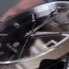
| 1076 forum posts 129 photos | An update [kind of] to this thread. The Impresart ones were unsatisfactory, with some letters upside down in relation to the shank orientation marks and some letters with defective or missing serifs. They were returned. So I settled for one of Zoro's Kennedy sans-serif sets. These were fine until last week when a piece broke off the most used letter [used about a dozen times on brass and mild steel only]. I bought a replacement for the damaged letter and a back-up for another letter, allegedly compatible with the original set, except they aren't, being in a markedly different font. At the same time I bought a Pryor set of sans-serif, 2mm in height. The problem with these is visible in the attached photo. Several of the letters are eccentric on the punch body, meaning that when I use them in my improvised jig [my milling vice and a hex head side screw for "indexing"] I cannot get equal spacing with some of the letters except with a lot of trial and error. In contrast the Kennedy set are all perfectly centred and with my jig I'm able to punch quite long strings of letters very evenly. A question that arises is does anyone here have a recently or not so recently purchased set of Pryor punches in which one or more of the letters is conspicuously displaced from the centre of the body? You can see that the worst offenders in my set are the E,I,U,V,X.
|
| Ian Johnson 1 | 17/12/2020 23:29:52 |
| 381 forum posts 102 photos | I thought I had a set of Pryor letter punches but it turns out I haven't! My 1/16" punches are made by Priority (made in England) and Priory (don't know where they were made)
But anyway they seem to be aligned okay. Is Pryor the same as Priority the same as Priory???? IanJ |
| Bill Phinn | 18/12/2020 02:33:38 |
| 1076 forum posts 129 photos | Thanks for your input, Ian. I can't really make out the faces of your 1.5mm letters. In the number set to the right the 7 looks decidedly off-centre. Is it just perspective? Off-centre characters are obviously not a problem for casual marking, especially with single letters, but spacing them evenly in a row using your own jig or one of the off-the-peg multi-character typeholders is going to make alignment difficult if not impossible in practice. Those typeholders do not have accompanying spacers, so either punches/type with off-centre characters are assumed by the manufacturers not to exist or their existence is tacitly acknowledged but the misalignment problems they cause is assumed to be a matter the end user should easily be able to get around or be indifferent to. I'm sorry but I don't know what connection if any there is between Pryor, Priority and Priory. Edited By Bill Phinn on 18/12/2020 02:36:25 |
| ega | 18/12/2020 11:23:29 |
| 2805 forum posts 219 photos | These old punches look hand made; if so, I marvel at the maker's skill:
|
| Ian Johnson 1 | 18/12/2020 13:04:54 |
| 381 forum posts 102 photos | Posted by Bill Phinn on 18/12/2020 02:33:38:
Thanks for your input, Ian. I can't really make out the faces of your 1.5mm letters. In the number set to the right the 7 looks decidedly off-centre.
I think it's just the camera angle Bill, here is a photo of a simple dividing head I made a while back, the graduation numbering was done with the same 1/16" punches with a rubbish jig to hold them but they came out okay |
| Clive Brown 1 | 18/12/2020 15:38:21 |
| 1050 forum posts 56 photos | Posted by Bill Phinn on 18/12/2020 02:33:38:.around or be indifferent to.
I'm sorry but I don't know what connection if any there is between Pryor, Priority and Priory. Pryor and Priority appear to be connected. They both use the Pryor trademark EP in a circular shape. Don't know about Priory. Incidentally, Arnold Throp was a senior figure at Pryor. He also put the "Dore" in Dore-Westbury. |
| blowlamp | 18/12/2020 16:16:41 |
 1885 forum posts 111 photos | Making these stamps sounds like a nice job for a CNC milling machine.
Martin. Edited By blowlamp on 18/12/2020 16:18:33 |
| bernard towers | 18/12/2020 22:49:48 |
| 1221 forum posts 161 photos | I have recently bought 1 mm sets from Pryor and use them in a jig and they are all perfectly aligned. When I bought them I asked about alignment and they assured me they were perfect and they were. |
| Bill Phinn | 19/12/2020 01:24:18 |
| 1076 forum posts 129 photos | Thank you for the further replies. Bernard, just to clarify, are your 1mm sets punches or are they type [intended only to be used in a typeholder, or jig of your own devising, unlike punches, which can be used freehand as well as in a jig]? The reason I ask is that Pryor seem to make greater claims of accuracy/uniformity for the type than they do for the punches. Even so, the present set of punches is too inaccurately made to be anything other than a nuisance to work with. For the record I think I should point out that a character that is visibly off-centre on the face won't necessarily be off-centre on the body, because it may be that the table the character sits on is itself off-centre the other way in relation to the body. The acid test is how the punched marks align when the shanks are evenly spaced using your jig. Unfortunately in my case the visible off-centredness is actual off-centredness as well. |
| roy entwistle | 19/12/2020 09:45:52 |
| 1716 forum posts | I have a set of 1/16 Priority punches that are perfectly on centre, but they must be 40 years old |
 , (edit no. 4: what the heck is that smiley doing there? It's meant to be a close bracket) which sums up the talent required:
 oAAOSws9Ba-JWA


Please login to post a reply.
Magazine Locator
Want the latest issue of Model Engineer or Model Engineers' Workshop? Use our magazine locator links to find your nearest stockist!
Sign up to our Newsletter
Sign up to our newsletter and get a free digital issue.
You can unsubscribe at anytime. View our privacy policy at www.mortons.co.uk/privacy
Latest Forum Posts
- *Oct 2023: FORUM MIGRATION TIMELINE*
05/10/2023 07:57:11 - Making ER11 collet chuck
05/10/2023 07:56:24 - What did you do today? 2023
05/10/2023 07:25:01 - Orrery
05/10/2023 06:00:41 - Wera hand-tools
05/10/2023 05:47:07 - New member
05/10/2023 04:40:11 - Problems with external pot on at1 vfd
05/10/2023 00:06:32 - Drain plug
04/10/2023 23:36:17 - digi phase converter for 10 machines.....
04/10/2023 23:13:48 - Winter Storage Of Locomotives
04/10/2023 21:02:11 - More Latest Posts...
- View All Topics
Support Our Partners


Shopping Partners
Subscription Offer

Latest "For Sale" Ads
- Reeves** - Rebuilt Royal Scot by Martin Evans
by John Broughton
£300.00 - BRITANNIA 5" GAUGE James Perrier
by Jon Seabright 1
£2,500.00 - Drill Grinder - for restoration
by Nigel Graham 2
£0.00 - WARCO WM18 MILLING MACHINE
by Alex Chudley
£1,200.00 - MYFORD SUPER 7 LATHE
by Alex Chudley
£2,000.00 - More "For Sale" Ads...
Latest "Wanted" Ads
- D1-3 backplate
by Michael Horley
Price Not Specified - fixed steady for a Colchester bantam mark1 800
by George Jervis
Price Not Specified - lbsc pansy
by JACK SIDEBOTHAM
Price Not Specified - Pratt Burnerd multifit chuck key.
by Tim Riome
Price Not Specified - BANDSAW BLADE WELDER
by HUGH
Price Not Specified - More "Wanted" Ads...
Get In Touch!
Do you want to contact the Model Engineer and Model Engineers' Workshop team?
You can contact us by phone, mail or email about the magazines including becoming a contributor, submitting reader's letters or making queries about articles. You can also get in touch about this website, advertising or other general issues.
Click THIS LINK for full contact details.
For subscription issues please see THIS LINK.
Digital Back Issues


Donate

 Register
 Log-in
Model Engineer Magazine
- Percival Marshall
- M.E. History
- LittleLEC
- M.E. Clock

ME Workshop
- An Adcock
- & Shipley
- Horizontal
- Mill
Subscribe Now
- Great savings
- Delivered to your door

Pre-order your copy!
- Delivered to your doorstep!
- Free UK delivery!
All Forum Topics > Workshop Tools and Tooling > Obtaining Serifed steel punches