Forum sponsored by:

NEW LOOK COVER FOR MEW
TELL US WHAT YOU THINK
| JasonB | 07/07/2022 15:39:48 |
 25215 forum posts 3105 photos 1 articles | The Bleeding of the Workshop lettering is a poor attempt at giving it a chrome look possibly to stop people thinking it covers other workshop activity liek woodwork. maybe with teh new glossy cover the graphics should be revisited
|
| JasonB | 07/07/2022 16:05:02 |
25215 forum posts 3105 photos 1 articles | Posted by Neil Wyatt on 07/07/2022 14:10:04:
If anyone wants to pre-order a copy of MEW 318 (perhaps to repeat Jason's stacking experiment) who hasn't got a subscription you may use this link: classicmagazines.co.uk/issue/mew/source/digital22 Thanks Neil You missed a trick Neil, should also have linked to the recent Binders thread, keeps those slippery mags under control or has that been the cunning plan all along |
| SillyOldDuffer | 07/07/2022 18:58:35 |
| 10668 forum posts 2415 photos | Let's appeal to a wider audience...
|
| Graham Titman | 07/07/2022 19:01:24 |
 158 forum posts 28 photos | FFS |
| Vic | 07/07/2022 19:44:08 |
| 3453 forum posts 23 photos | Get rid of the chainsaw rubbish at the top would be my suggestion.
|
| Howard Lewis | 07/07/2022 20:27:32 |
| 7227 forum posts 21 photos | Certainly +1 for that Howard |
| Howard Lewis | 07/07/2022 21:13:37 |
| 7227 forum posts 21 photos | S O D Issue 666 is a devil ,of an idea! Just being catty Howard |
| Peter G. Shaw | 07/07/2022 21:33:47 |
 1531 forum posts 44 photos | Vic, Reasonable idea, but please retain the Issue Number in its usual position and size. Placing it 1/4 of the way down and in tiny letters is just not on. Regards, Peter G. Shaw |
| Neil Wyatt | 08/07/2022 11:14:49 |
 19226 forum posts 749 photos 86 articles | Posted by SillyOldDuffer on 07/07/2022 18:58:35:
Let's appeal to a wider audience...
That's 319 right there...
|
| Neil Wyatt | 08/07/2022 11:16:50 |
19226 forum posts 749 photos 86 articles | Posted by Vic on 07/07/2022 19:44:08:
Get rid of the chainsaw rubbish at the top would be my suggestion. Serious question - why?
Edited By JasonB on 08/07/2022 12:08:32 |
| Hopper | 08/07/2022 11:57:23 |
 7881 forum posts 397 photos | Common practice on many magazines and newspapers from the Guardian to the Daily Tele to have pointers above the masthead. Apparently it works for them.
Edited By Hopper on 08/07/2022 12:23:45 |
| JasonB | 08/07/2022 12:09:23 |
25215 forum posts 3105 photos 1 articles | Posted by Neil Wyatt on 08/07/2022 11:16:50:
Posted by Vic on 07/07/2022 19:44:08:
Get rid of the chainsaw rubbish at the top would be my suggestion. Serious question - why?
Edited By JasonB on 08/07/2022 12:08:32 Sorry edited your post rather than quoted but this is my reply as to why Because it would be better placed below the title, which would still have it in the visible part of the page . Keep the title at the top and one liners below. Look at issues before 151 and just move the date below Workshop then the title can sit even higher Edited By JasonB on 08/07/2022 12:15:59 |
| Nick Wheeler | 08/07/2022 12:36:38 |
| 1227 forum posts 101 photos | Posted by Neil Wyatt on 08/07/2022 11:16:50:
Posted by Vic on 07/07/2022 19:44:08:
Get rid of the chainsaw rubbish at the top would be my suggestion. Serious question - why?
Serious answer - because it is just more clutter for the eye to not focus on.
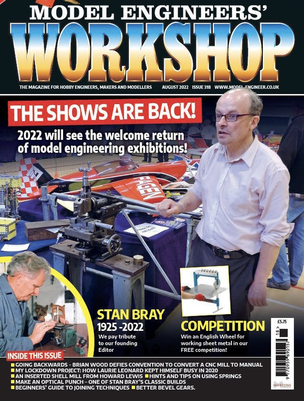
Replace it with the "The magazine for....." strapline. The issue number doesn't need to be repeated with the month. Lose the website address, anyone likely to use it will already have the mag in their hands. The "Shows are back" headline is enough by itself. Similarly, "Win an English wheel" The list at the bottom should be more concise; "Laurie's lockdown project", "Stan Bray's classic optical punch", "Converting a CNC mill to manual???" The photo is an excellent example of what not to use as it's hugely cluttered but also has loads of wasted space and it's hard to see what the central machine is with all the overlapping items. |
| Hopper | 08/07/2022 13:12:47 |
7881 forum posts 397 photos | Posted by Nicholas Wheeler 1 on 08/07/2022 12:36:38:
Posted by Neil Wyatt on 08/07/2022 11:16:50:
Posted by Vic on 07/07/2022 19:44:08:
Get rid of the chainsaw rubbish at the top would be my suggestion. Serious question - why?
Serious answer - because it is just more clutter for the eye to not focus on.
Replace it with the "The magazine for....." strapline. On the other hand, the scientific research shows readers invariably enter a page through a photo and almost never through printed words. So having a pointer at the top of the page with even a small photo will draw readers in when the main photo is hidden behind another magazine below it on the news-stand. A written strap line or even the large masthead does not provide a point of entry for readers. They will scan straight past it to the next interesting image, the science shows. A lot of research has been done on this stuff, measured by laser beams bounced off eyeballs of surveyed readers to measure precisely what they look at and when they look at it when reading newspapers and magazines. A lot of the results are quite surprising. Another big one is that invariably pages work best with one large "Dominant Visual Element" (either a photo or graphic) and one or several smaller visual elements (either pics or graphics) on the page for readers to move back and forth between. Only they do most readers move on to actually reading a headline. Next best read after the headline is photo captions. So that's why many newspapers and magazines these days have pictorial pointers above the masthead. It's science. (And it sells newspapers/magazines.) Edited By Hopper on 08/07/2022 13:16:47 |
| JasonB | 08/07/2022 13:17:46 |
25215 forum posts 3105 photos 1 articles | If that's the case then stick the competition at the top rather than a chainsaw adjuster that most won't have a need for. |
| Neil Wyatt | 08/07/2022 14:15:58 |
19226 forum posts 749 photos 86 articles | Posted by JasonB on 08/07/2022 12:09:23:
Posted by Neil Wyatt on 08/07/2022 11:16:50:
Posted by Vic on 07/07/2022 19:44:08:
Get rid of the chainsaw rubbish at the top would be my suggestion. Serious question - why?
Edited By JasonB on 08/07/2022 12:08:32 Sorry edited your post rather than quoted but this is my reply as to why Because it would be better placed below the title, which would still have it in the visible part of the page . Keep the title at the top and one liners below. Look at issues before 151 and just move the date below Workshop then the title can sit even higher Edited By JasonB on 08/07/2022 12:15:59 That doesn't explain why it would be better. Neil |
| Neil Wyatt | 08/07/2022 14:21:43 |
19226 forum posts 749 photos 86 articles | It's interesting, because the changes were all specifically asked for on the grounds they encourage more sales. What's needed to ensure the future of the magazine is to attract new readers in a way that doesn't alienate existing ones. Are regular readers deeply concerned about things other than can they identify the magazine quickly, will it slip off the piles and can I find the issue number easily? Are the graphic layout changes just minor niggles or genuinely upsetting? Neil |
| duncan webster | 08/07/2022 14:23:25 |
| 5307 forum posts 83 photos | Took me a while to work out what I was looking at. A shaper in a scrap yard? |
| Ches Green UK | 08/07/2022 14:37:58 |
| 181 forum posts 7 photos | An example of an 'engineering' magazine cover that is attractive, carries a clear message and entices one inside..... **LINK** Ches
|
| lee webster | 08/07/2022 15:43:32 |
| 383 forum posts 71 photos | Perhaps I am easy to please,but I can't see anything wrong with the cover as shown. I buy a magazine not by what it looks like, but by what it contains. A few months back I bought a copy of MEW because it had a mention on the cover of electroplating 3D prints. Lee |


Please login to post a reply.
Magazine Locator
Want the latest issue of Model Engineer or Model Engineers' Workshop? Use our magazine locator links to find your nearest stockist!
Sign up to our Newsletter
Sign up to our newsletter and get a free digital issue.
You can unsubscribe at anytime. View our privacy policy at www.mortons.co.uk/privacy
Latest Forum Posts
- *Oct 2023: FORUM MIGRATION TIMELINE*
05/10/2023 07:57:11 - Making ER11 collet chuck
05/10/2023 07:56:24 - What did you do today? 2023
05/10/2023 07:25:01 - Orrery
05/10/2023 06:00:41 - Wera hand-tools
05/10/2023 05:47:07 - New member
05/10/2023 04:40:11 - Problems with external pot on at1 vfd
05/10/2023 00:06:32 - Drain plug
04/10/2023 23:36:17 - digi phase converter for 10 machines.....
04/10/2023 23:13:48 - Winter Storage Of Locomotives
04/10/2023 21:02:11 - More Latest Posts...
- View All Topics
Support Our Partners


Shopping Partners
Subscription Offer

Latest "For Sale" Ads
- Reeves** - Rebuilt Royal Scot by Martin Evans
by John Broughton
£300.00 - BRITANNIA 5" GAUGE James Perrier
by Jon Seabright 1
£2,500.00 - Drill Grinder - for restoration
by Nigel Graham 2
£0.00 - WARCO WM18 MILLING MACHINE
by Alex Chudley
£1,200.00 - MYFORD SUPER 7 LATHE
by Alex Chudley
£2,000.00 - More "For Sale" Ads...
Latest "Wanted" Ads
- D1-3 backplate
by Michael Horley
Price Not Specified - fixed steady for a Colchester bantam mark1 800
by George Jervis
Price Not Specified - lbsc pansy
by JACK SIDEBOTHAM
Price Not Specified - Pratt Burnerd multifit chuck key.
by Tim Riome
Price Not Specified - BANDSAW BLADE WELDER
by HUGH
Price Not Specified - More "Wanted" Ads...
Get In Touch!
Do you want to contact the Model Engineer and Model Engineers' Workshop team?
You can contact us by phone, mail or email about the magazines including becoming a contributor, submitting reader's letters or making queries about articles. You can also get in touch about this website, advertising or other general issues.
Click THIS LINK for full contact details.
For subscription issues please see THIS LINK.
Digital Back Issues


Donate

 Register
 Log-in
Model Engineer Magazine
- Percival Marshall
- M.E. History
- LittleLEC
- M.E. Clock

ME Workshop
- An Adcock
- & Shipley
- Horizontal
- Mill

Subscribe Now
- Great savings
- Delivered to your door

Pre-order your copy!
- Delivered to your doorstep!
- Free UK delivery!
All Forum Topics > Model Engineers' Workshop. > NEW LOOK COVER FOR MEW