Wallis & Steevens Water Cart in 1' scale
| Richard S2 | 17/12/2020 13:29:20 |
237 forum posts 135 photos |
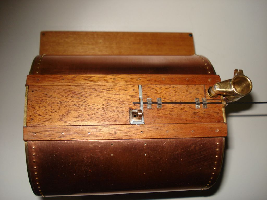
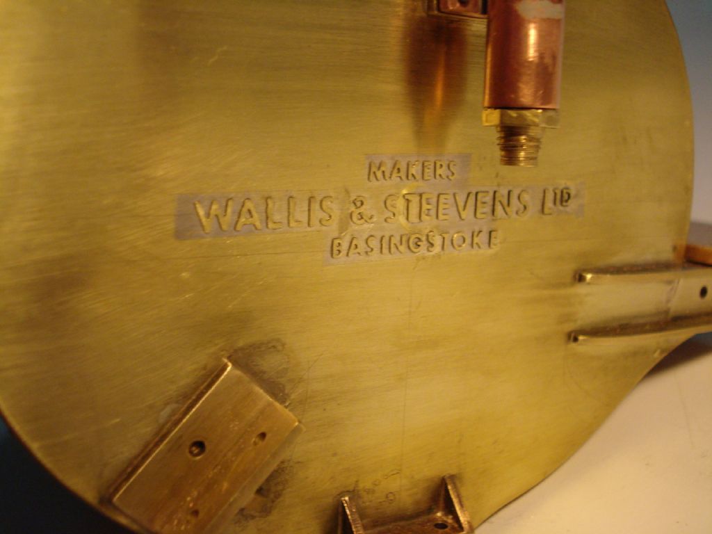
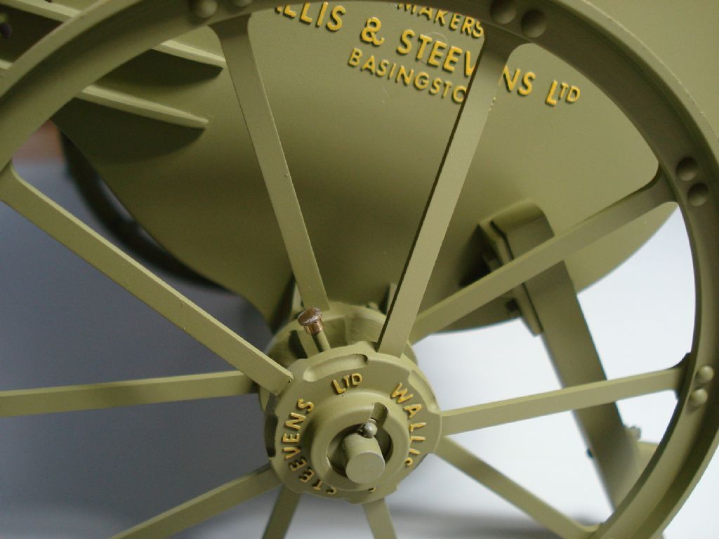
I'm getting close to the top coat stage of this scratch build project now. Complied with the early original design option of using wood for the top areas and tank lid. I've used mahogany where they probably used elm?- I was glad to get past the job of soldering the individual letters onto the tank end plates- Not perfect, as a couple of letters had moved slightly and I had to make the Ampersands (& ) from bits in 3mm height lettering, but hopefully won't show from behind the wheels. A reasonable representation of the 'cast in' pattern of the original and looks better after a coat of 2 part etch primer- Most of the tank lid furniture is made from nickel silver and fixed with 1/32" rivets- More finishing to do on the woodwork, then it's ready for the drab matt green top coat. There are several images in my album which covers the work up to now if interested. I'll add to this 'thread' as I progress from now and will be dependant on progress of the painting and assembly of my 1' modded Minnie, to which this Cart will be attached to. Regards Edited By Richard S2 on 17/12/2020 13:30:49 |
| William Chitham | 17/12/2020 15:22:28 |
| 156 forum posts 56 photos | That's beautiful. Are the letters commercially available or did you make them somehow and looking at the album how did you do the wheel hubs, are they cast? William. |
| Dalboy | 17/12/2020 16:24:14 |
1009 forum posts 305 photos | Great workmanship I just looked through what you had done to get to this stage and it does seem a shame to have painted it, but when you are trying to get it looking like the original I understand why. |
| Jeff Dayman | 17/12/2020 16:39:53 |
| 2356 forum posts 47 photos | Top notch work Richard! |
| Richard S2 | 02/01/2021 20:51:07 |
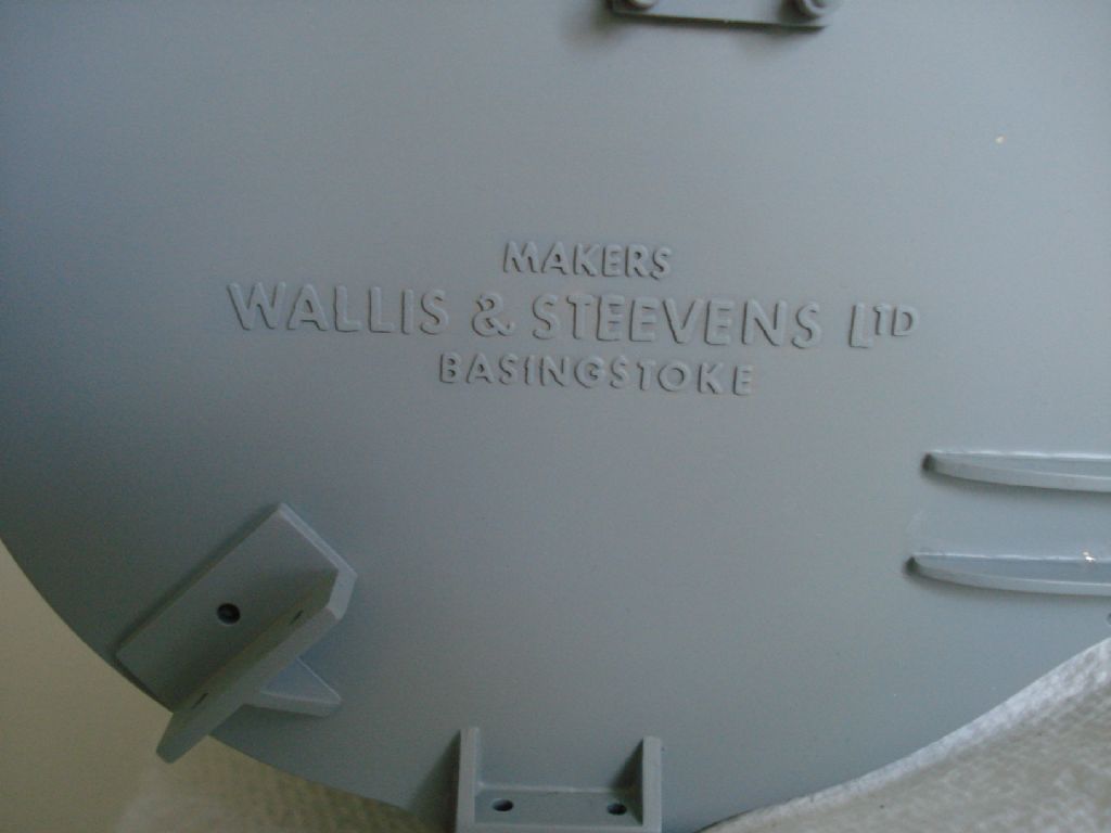
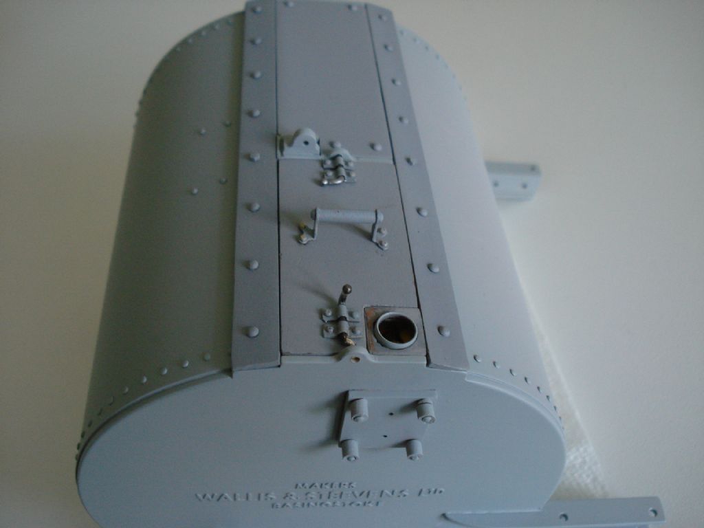
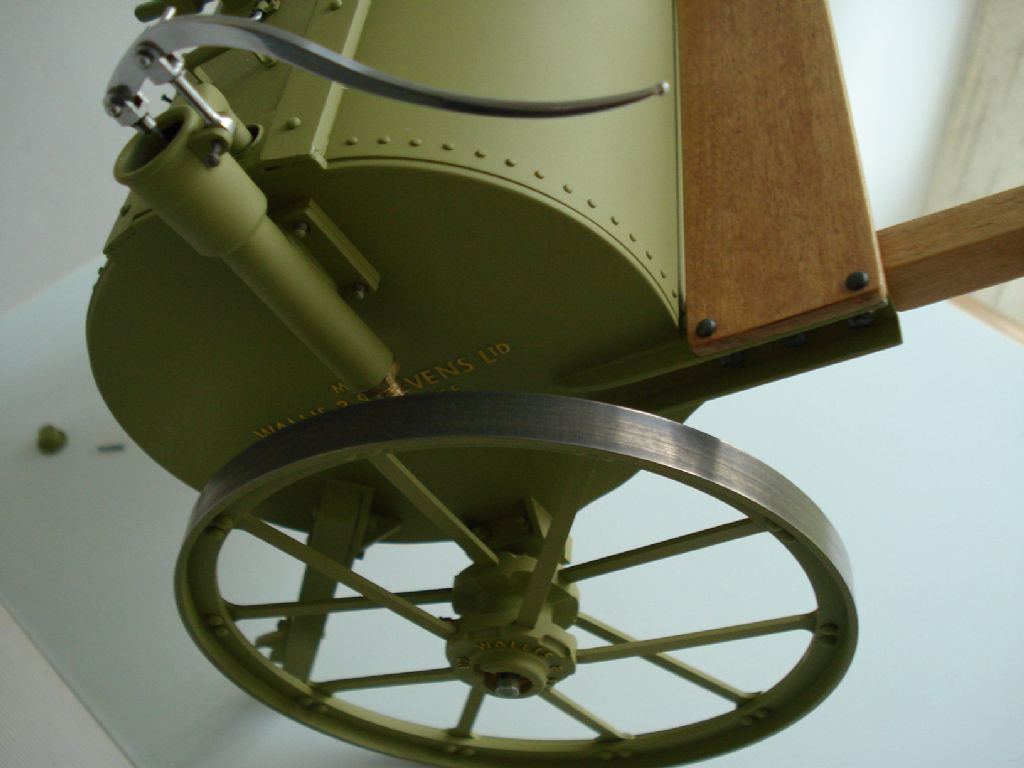
237 forum posts 135 photos | Thanks all for the positive responses. I replied to William via PM same day. Posted by Derek Lane on 17/12/2020 16:24:14: Great workmanship I just looked through what you had done to get to this stage and it does seem a shame to have painted it, but when you are trying to get it looking like the original I understand why. Yep!, bit of a shame Derek, but needs must. Made fair progress on the main paint and picked out the raised lettering. Rather intense concentration trying to paint these with a 6 bristle sable brush and a x5 dioptra Loupe. This is the only pic at the moment- Need to get some more matt varnish for final coat before proper assembly. Reasonably pleased with the finish considering my tired old Airbrush (Badger 200) is now 45 years old. Regards |
| Tim Stevens | 03/01/2021 14:56:49 |
1779 forum posts 1 photos | The only comment I make on your lettering is this: To anyone versed in the history of lettering design, the style you have chosen does not match the date of the original. Unless of course, your water cart was made after about 1927. In typeface terms, it might be Futura, or Spartan, or one or two others - I would need to see other letters to be more certain. I wonder if there is enough interest in this 'arcane corner' of design history (from an ME point of view) for an article about matching the letters to the job? Regards - Tim (who once, long ago, designed typefaces for Amstrad)
|
| Tim Stevens | 03/01/2021 14:56:50 |
1779 forum posts 1 photos | Sorry - twice again! Tim Edited By Tim Stevens on 03/01/2021 14:57:28 |
| Richard S2 | 26/03/2021 16:13:40 |
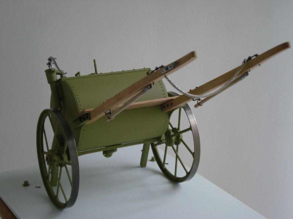
237 forum posts 135 photos | Thank you for your observations/contribution. So continuing with this reasonable representation of the brand's model, I managed to dull the finish on the shiny wheel tread faces and now seem to look better- Nearly finished, and just the Drawabar to make that will replace the shafts. It can then be hooked up to the Modded Minnie TE- |
| Richard S2 | 13/11/2021 14:26:16 |
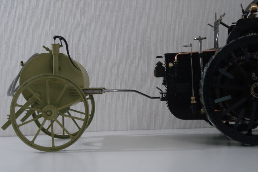
237 forum posts 135 photos | Now the Minnie T/Engine is back in one piece on 'all fours', I've finished fabricating the alternative drawbar for this cart. Trial fit - Just the painting of the drawbar and some plumbing/hose parts to do and it will be finished. |
| SillyOldDuffer | 13/11/2021 15:02:21 |
| 10668 forum posts 2415 photos | Posted by Tim Stevens on 03/01/2021 14:56:49:
The only comment I make on your lettering is this: To anyone versed in the history of lettering design, the style you have chosen does not match the date of the original. ... I wonder if there is enough interest in this 'arcane corner' of design history (from an ME point of view) for an article about matching the letters to the job? Regards - Tim (who once, long ago, designed typefaces for Amstrad)
I've dabbled trying to recreate realistic period signage with Inkscape and found it to hard to identify modern fonts to do authentic ye olde lettering, for 3D and ordinary paper printing. I found it necessary to mix and match letters from various fonts, and to individually modify certain characters and punctuation by editing the splines of the underlying glyphs. Tedious and imperfect. Although I suspect many early cast-metal signs used home-made fonts that don't match anything standard exactly, I'm certain part of the problem was my general ignorance of font families and not knowing how styles changed over time. Any advice on finding or making period correct fonts would be most welcome. Dave |
| Harry Wilkes | 13/11/2021 18:10:33 |
1613 forum posts 72 photos | Nice work H |
| Michael Gilligan | 13/11/2021 18:24:30 |
23121 forum posts 1360 photos | Good specimen of the appropriate font, here: **LINK** http://www.whoisgeorgemills.com/2010/07/wallis-steevens-george-uncle-dudley-and.html MichaelG. |
| Richard S2 | 14/11/2021 13:18:06 |
237 forum posts 135 photos | Posted by Michael Gilligan on 13/11/2021 18:24:30:
Good specimen of the appropriate font, here: **LINK** MichaelG. Thank you. I did use images of full sized examples for research initially and my available stock of lettering was close enough for me. I had no intention of making more lettering to a presupposed idea of what it may have looked like around 1900. So for anyone who is bothered by it, can peruse the images of a full size Cart example on this - LINK - for another comparison. I can't post them (or others) into this Topic, as they are copyrighted. |
| Dalboy | 14/11/2021 13:27:51 |
1009 forum posts 305 photos | They look close enough to me a good job Richard. Many times when modeling something if it is built to exact scale it just does not look right so a little artistic licence is required to make it look correct. |
| Michael Gilligan | 14/11/2021 23:24:15 |
23121 forum posts 1360 photos | Posted by Richard S2 on 14/11/2021 13:18:06:
Posted by Michael Gilligan on 13/11/2021 18:24:30:
Good specimen of the appropriate font, here: **LINK** MichaelG. Thank you. I did use images of full sized examples for research initially and my available stock of lettering was close enough for me. I had no intention of making more lettering to a presupposed idea of what it may have looked like around 1900. […] . No criticism from me, Richard ! … I think you’ve done a superb job. MichaelG. |
Please login to post a reply.
Want the latest issue of Model Engineer or Model Engineers' Workshop? Use our magazine locator links to find your nearest stockist!
Sign up to our newsletter and get a free digital issue.
You can unsubscribe at anytime. View our privacy policy at www.mortons.co.uk/privacy
- *Oct 2023: FORUM MIGRATION TIMELINE*
05/10/2023 07:57:11 - Making ER11 collet chuck
05/10/2023 07:56:24 - What did you do today? 2023
05/10/2023 07:25:01 - Orrery
05/10/2023 06:00:41 - Wera hand-tools
05/10/2023 05:47:07 - New member
05/10/2023 04:40:11 - Problems with external pot on at1 vfd
05/10/2023 00:06:32 - Drain plug
04/10/2023 23:36:17 - digi phase converter for 10 machines.....
04/10/2023 23:13:48 - Winter Storage Of Locomotives
04/10/2023 21:02:11 - More Latest Posts...
- View All Topics
- Reeves** - Rebuilt Royal Scot by Martin Evans
by John Broughton
£300.00 - BRITANNIA 5" GAUGE James Perrier
by Jon Seabright 1
£2,500.00 - Drill Grinder - for restoration
by Nigel Graham 2
£0.00 - WARCO WM18 MILLING MACHINE
by Alex Chudley
£1,200.00 - MYFORD SUPER 7 LATHE
by Alex Chudley
£2,000.00 - More "For Sale" Ads...
- D1-3 backplate
by Michael Horley
Price Not Specified - fixed steady for a Colchester bantam mark1 800
by George Jervis
Price Not Specified - lbsc pansy
by JACK SIDEBOTHAM
Price Not Specified - Pratt Burnerd multifit chuck key.
by Tim Riome
Price Not Specified - BANDSAW BLADE WELDER
by HUGH
Price Not Specified - More "Wanted" Ads...
Do you want to contact the Model Engineer and Model Engineers' Workshop team?
You can contact us by phone, mail or email about the magazines including becoming a contributor, submitting reader's letters or making queries about articles. You can also get in touch about this website, advertising or other general issues.
Click THIS LINK for full contact details.
For subscription issues please see THIS LINK.
Model Engineer Magazine
- Percival Marshall
- M.E. History
- LittleLEC
- M.E. Clock
ME Workshop
- An Adcock
- & Shipley
- Horizontal
- Mill
Subscribe Now
- Great savings
- Delivered to your door
Pre-order your copy!
- Delivered to your doorstep!
- Free UK delivery!







 Register
 Log-in


