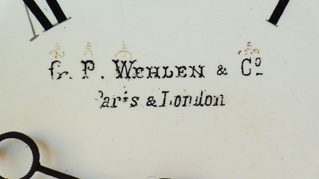
Hieroglyphics on a Wehlen & Co clock face
Can anyone identify the markings?
| SillyOldDuffer | 11/08/2019 11:14:22 |
| 10668 forum posts 2415 photos | Posted by Michael Gilligan on 11/08/2019 09:41:43:
Posted by Sam Stones on 09/08/2019 00:11:00:
. Anything's possible, Dave ... but my bet is still on the marks being some sort of shorthand for the size and style of the four capitals. MichaelG. . . P.S. [slight digression] **LINK** is not playing nicely on my iPad, but this is worth a look:
Thanks for the link, Daffy Duck etched in miniature on an Integrated Circuit indeed! I like your idea too, not least because it explains the three horizontal lines. Is it a coincidence that in this list of modern proofreading symbols, 3 bars means 'Put this in Capitals'? Sam's question has me wondering if other old clock faces ever feature strange markings? A quick scan through the catalogues of antique clock sellers was disappointing because the photos aren't good enough to decode the interesting blurs. Dave
|
| Nick Clarke 3 | 11/08/2019 20:11:57 |
1607 forum posts 69 photos | Posted by SillyOldDuffer on 11/08/2019 11:14:22:
I like your idea too, not least because it explains the three horizontal lines. Is it a coincidence that in this list of modern proofreading symbols, 3 bars means 'Put this in Capitals'? Sam's question has me wondering if other old clock faces ever feature strange markings? A quick scan through the catalogues of antique clock sellers was disappointing because the photos aren't good enough to decode the interesting blurs. Dave
I am sorry but I cannot give you a correct answer. For more that the last thirty years I have been involved in teaching, lecturing and studying typography, and I have never seen anything that matches these exactly. Firstly the proofreader's mark for capitals is marked underneath the text not above it. (I used to work for a guy who was a craft proofreader and Eric would mark up any memo sent to him to be corrected!!) There are several reasons why I can't concur with the suggestions already given. Firstly the marks are not over all capitals, and if they indicate capitalisation why are the first two different? Also the third one is over the abbreviation for company and, while there are dots above the second row they are not only above the capitals and finally why paint on these symbols when you could paint on the words themselves! I would suggest that giving typographical instructions which are intended for printers would mean little or nothing to a guy with a brush. I still don't know what they are, but I cannot see that they would be typographical. I just don't see it. Edited By Nick Clarke 3 on 11/08/2019 20:14:40 |
| Michael Gilligan | 11/08/2019 20:42:43 |
23121 forum posts 1360 photos | Posted by Nick Clarke 3 on 11/08/2019 20:11:
[ ... ] For more that the last thirty years I have been involved in teaching, lecturing and studying typography, and I have never seen anything that matches these exactly. Firstly the proofreader's mark for capitals is marked underneath the text not above it. (I used to work for a guy who was a craft proofreader and Eric would mark up any memo sent to him to be corrected!!) There are several reasons why I can't concur with the suggestions already given. Firstly the marks are not over all capitals, and if they indicate capitalisation why are the first two different? Also the third one is over the abbreviation for company and, while there are dots above the second row they are not only above the capitals and finally why paint on these symbols when you could paint on the words themselves! I would suggest that giving typographical instructions which are intended for printers would mean little or nothing to a guy with a brush. I still don't know what they are, but I cannot see that they would be typographical. I just don't see it. . I am in no position to argue with a man of your experience, Nick But I do have a few observations [assuming that your reply was not meant exclusively for Dave] The marks are over all of the 'feature' [for want of a better word] capitals in the Signature [i.e.the bit that is particular to this job. My hypothesis is that:
Looking at them in context ... I feel that I can almost 'read' them myself, intuitively. MichaelG. |
| Michael Gilligan | 11/08/2019 20:48:30 |
23121 forum posts 1360 photos |
. Quoted again, for convenient reference on this new page. |
| Michael Gilligan | 13/08/2019 00:58:54 |
23121 forum posts 1360 photos | Posted by SillyOldDuffer on 11/08/2019 11:14:22: ... Daffy Duck etched in miniature on an Integrated Circuit indeed! . This version of the Silicon Zoo seems to be working: **LINK** https://micro.magnet.fsu.edu/creatures/ [sorry, Sam ... no progress on the dial glyphs] MichaelG. |
| Sam Stones | 13/08/2019 03:01:36 |
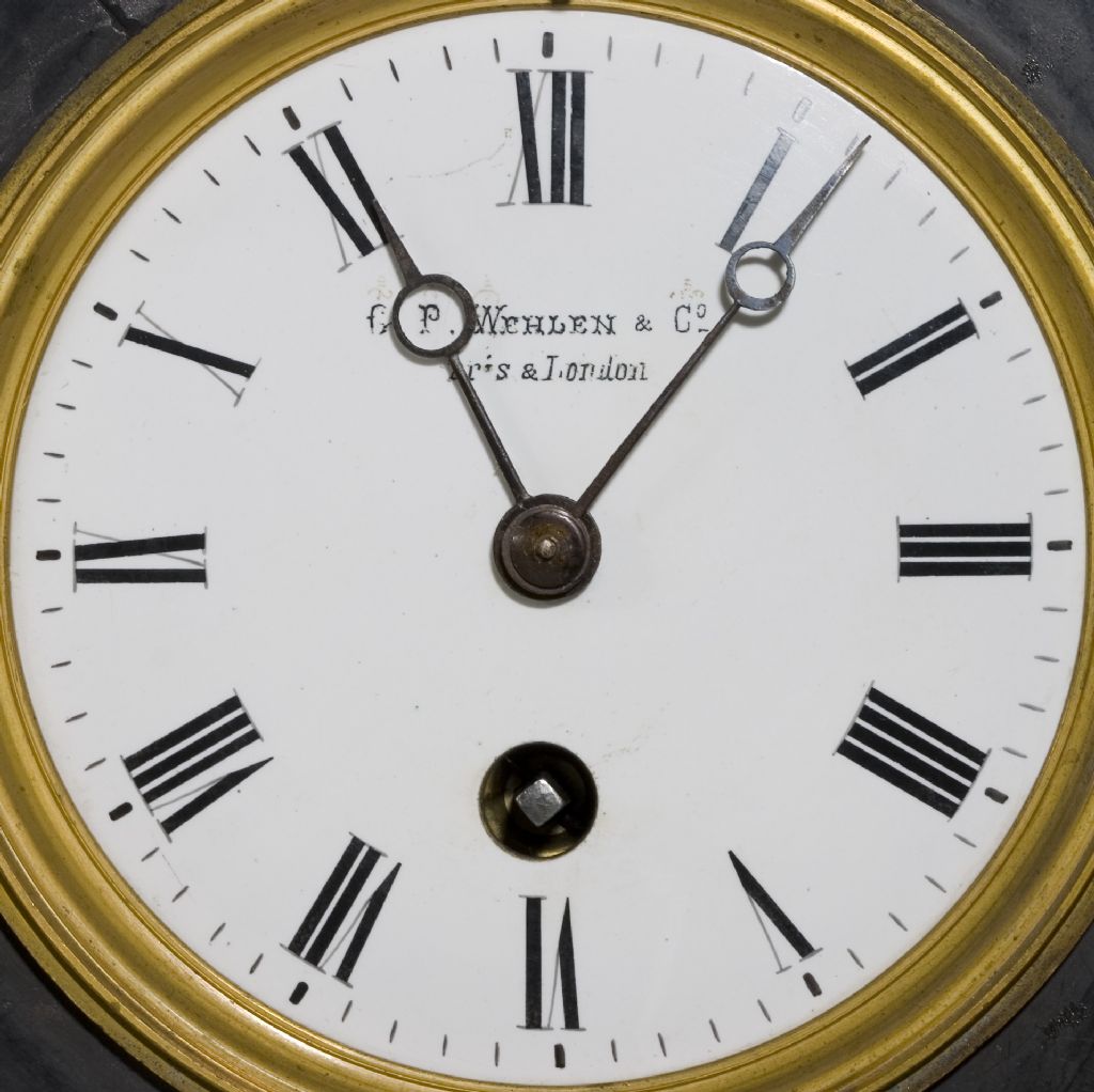
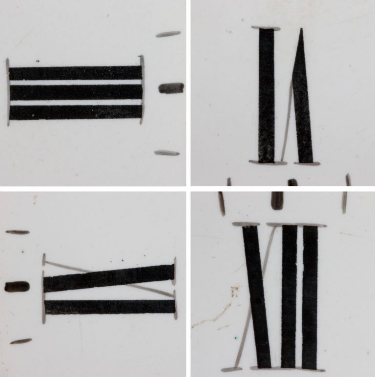
922 forum posts 332 photos | Like a clock pendulum, the dialogue has swung back and forth. With little to add other than my appreciation for all the interest and direction, I decided to move on to (SOD) Dave’s comments about the method used to apply the Roman (Latin?) numerals. There was a possibility too that the outcome may prove useful to modellers who are keen to embellish their work with a high level of realism. Here's my latest clock face ... And a composite of four numerals ... Here are some extra details … Detectable by touch and from my earlier (flash illuminated) picture, the characters appear to have been painted. For scaling purposes, the numerals are 7/16" (11mm) in height.
What method(s) did they use? Sam Re Silicon Zoo – I’m looking forward to the exploration Michael. It look fabulous. |
| John McNamara | 13/08/2019 09:21:46 |
1377 forum posts 133 photos | Hi Sam I know that modern watch faces are often Pad printed. (As well as billions of bottles and the like) It works well on curved surfaces. I also read somewhere that this process goes back 100 years? |
| Nigel Graham 2 | 13/08/2019 10:10:02 |
| 3293 forum posts 112 photos | I'm as intrigued as everyone else on the real meaning of those symbols, which I wonder may be visible by some accident of manufacture or aging rather than intent, but "Pad" printing? That's a new one on me - I understand offset-lithography and screen-printing, and of course the inked-stamp form going back to William Caxton; but had not heard of that, so thank you for that link. Screen Printing goes back to antiquity as an art form but its modern industrial version is used on anything from simple labels and dials to the very high accuracy and precision requires in mass-producing printed-circuit boards. |
| Michael Gilligan | 13/08/2019 10:20:51 |
23121 forum posts 1360 photos | Posted by Sam Stones on 13/08/2019 03:01:36:
[ ... ]
What method(s) did they use?.
. I have failed to find a decent illustration, Sam ... but my understanding is that they used a rotating table with various angular divisions, and a linear guide-bar to steady the hand [and to facilitate drawing circles]. ... Think of some hybrid between an Animator's desk and a Sign-Writer's Mahl Stick. ... or, indeed, a Rotary Table on your Milling Machine. Then it's 'just' a matter of using pens & brushes, with nerves of steel. MichaelG. |
| Michael Gilligan | 13/08/2019 10:24:20 |
23121 forum posts 1360 photos | Posted by Nigel Graham 2 on 13/08/2019 10:10:02:
... those symbols, which I wonder may be visible by some accident of manufacture or aging rather than intent, . That's my belief, Nigel MichaelG. |
| Michael Gilligan | 13/08/2019 10:30:09 |
23121 forum posts 1360 photos | Posted by Nigel Graham 2 on 13/08/2019 10:10:02: "Pad" printing? That's a new one on me - . Then you will probably enjoy this: **LINK** https://m.youtube.com/watch?v=e-TUgxgGRWs MichaelG. |
| Nick Clarke 3 | 13/08/2019 15:21:21 |
1607 forum posts 69 photos | Posted by Michael Gilligan on 13/08/2019 10:20:51:
Posted by Sam Stones on 13/08/2019 03:01:36:
[ ... ]
What method(s) did they use?.
. I have failed to find a decent illustration, Sam ... but my understanding is that they used a rotating table with various angular divisions, and a linear guide-bar to steady the hand [and to facilitate drawing circles]. ... Think of some hybrid between an Animator's desk and a Sign-Writer's Mahl Stick. ... or, indeed, a Rotary Table on your Milling Machine. Then it's 'just' a matter of using pens & brushes, with nerves of steel. MichaelG. In a different context, bit have a look at this hand lining. **LINK** |
| stephen goodbody | 13/08/2019 16:34:28 |
| 74 forum posts 43 photos | I'm inclined to agree with Michael - I suspect that they're a form of symbolic shorthand used by the clock's manufacturer to define what should be written where (what letters, truncation, case, location and spacing). Speculating further, this may have been to allow the dials to be farmed out to piecework sign-writers. Speculating even further, the sign-writers may also possibly have had little knowledge of English. Each symbol seems to be associated with a specific section of the text, hence "Fr.", "P.", "Whelan" and "Co." each have their own symbol. Although not conclusive, I believe the wave symbol over the "Fr." may indicate a suspended term - a word which is truncated and replaced by a mark. The location of each symbol presumably indicates the desired placement of the word. The symbol above the W in Whelan seems to indicate the desired width of the letter W in addition to its placement. Presumably nothing else in the word "Whelan" needed further explanation as they were presumably the employer or customer. The three bars in each symbol seems to suggest the instruction that the first letter should be upper-case. A quick Wikipedia search for Scribal Abbreviation seems to yield some possible additional clues. Interesting stuff - good luck with the search! Steve Edited By stephen goodbody on 13/08/2019 16:38:11 |
| Nick Clarke 3 | 13/08/2019 17:43:41 |
1607 forum posts 69 photos | I am still unconvinced by many of the suggestions here - not because they don't offer a reasonable meaning to the symbols, but rather to their logic and the practical side of putting them on there in the first place. While I agree the G (not Fr), the P, the W and the Co in the top lines are all contractions for the full name of the company, Gustav Paul Wehlen and Company the marks appear from the close up on the first page of this post to have been painted onto the dial, along with the rest of the text and the markings. if it was to tell someone what to paint this would appear to be a very silly way of going about it as you would still need to tell the painter what to write. Suggesting the maker said "I want you to put Captal G, full stop, Capital P, full stop, Wehlen with a capital W and the rest of the word in small caps then an ampersand the same height as the small caps then Co abbreviation for company with the o superscript and underlined. I have already painted some marks on the dial to show you the size and placing of the capital letters and abbreviations to help you" It is just not believable. The marks have not helped the painter much as regards letter width anyway! Wouldn't it be easier to have just given the information on a piece of paper?? The company was based in Cullum Street in the City of London and in Paris where the same latin script was in use, with the possible exception of the W in France - so putting the dial out to a local outworker would suggest that he or she was familiar with the letter shapes required. Were I wanting to tell someone how to paint this text I would want to tell them what script size and style to use, which is not easily identified from this - I think telling someone that the G was a capital and an abbreviation for a longer word is of no value if you are just being asked to paint G - and if you don't know how to do that you would need a drawing or a copy of the required text to follow not marks. Edited By Nick Clarke 3 on 13/08/2019 17:48:00 |
| Brian H | 13/08/2019 17:49:39 |
2312 forum posts 112 photos | I wonder if an approach to the BHI (British Horological Institute) would be useful. They are normally very helpful. Brian |
| Brian G | 13/08/2019 18:01:11 |
| 912 forum posts 40 photos | Posted by Bill Phinn on 09/08/2019 02:26:37:
Is it possible it's just rubricated (and now somewhat faded) flourishing over the letters, i.e. solely decorative? Could it be glue residue from gilding which has since been lost? I assume the decoration on the case is gilt. Brian |
| Neil Wyatt | 13/08/2019 20:44:33 |
19226 forum posts 749 photos 86 articles | I'm interested that the inner set of serifs for the numerals is curved, but the outer one is straight. This isn't an easy effect to achieve if using a built in font to generate them on a computer, although you can obviously draw the symbols from scratch like this. Is this normal practice? Neil |
| Michael Gilligan | 13/08/2019 20:59:10 |
23121 forum posts 1360 photos | Posted by Neil Wyatt on 13/08/2019 20:44:33:
I'm interested that the inner set of serifs for the numerals is curved, but the outer one is straight. . 'though not quite consistently Have a look at theVI for example I wonder: ... is the variation by accident, or design ? MichaelG. |
| Nick Clarke 3 | 14/08/2019 07:54:24 |
1607 forum posts 69 photos | Posted by Neil Wyatt on 13/08/2019 20:44:33:
I'm interested that the inner set of serifs for the numerals is curved, but the outer one is straight. This isn't an easy effect to achieve if using a built in font to generate them on a computer, although you can obviously draw the symbols from scratch like this. Is this normal practice? Neil Or might that be an effect of the dial face being domed and not flat, or painted that way because the dial is in fact domed? |
| Andy Carruthers | 14/08/2019 10:37:15 |
317 forum posts 23 photos | Is it possible the annotations are a combination of proofreader marks and manufacturer code? This site suggests the three horizontal strikes are for capitalizing: **LINK** |
Please login to post a reply.
Want the latest issue of Model Engineer or Model Engineers' Workshop? Use our magazine locator links to find your nearest stockist!
Sign up to our newsletter and get a free digital issue.
You can unsubscribe at anytime. View our privacy policy at www.mortons.co.uk/privacy
- hemingway ball turner
04/07/2025 14:40:26 - *Oct 2023: FORUM MIGRATION TIMELINE*
05/10/2023 07:57:11 - Making ER11 collet chuck
05/10/2023 07:56:24 - What did you do today? 2023
05/10/2023 07:25:01 - Orrery
05/10/2023 06:00:41 - Wera hand-tools
05/10/2023 05:47:07 - New member
05/10/2023 04:40:11 - Problems with external pot on at1 vfd
05/10/2023 00:06:32 - Drain plug
04/10/2023 23:36:17 - digi phase converter for 10 machines.....
04/10/2023 23:13:48 - More Latest Posts...
- View All Topics
- Reeves** - Rebuilt Royal Scot by Martin Evans
by John Broughton
£300.00 - BRITANNIA 5" GAUGE James Perrier
by Jon Seabright 1
£2,500.00 - Drill Grinder - for restoration
by Nigel Graham 2
£0.00 - WARCO WM18 MILLING MACHINE
by Alex Chudley
£1,200.00 - MYFORD SUPER 7 LATHE
by Alex Chudley
£2,000.00 - More "For Sale" Ads...
- D1-3 backplate
by Michael Horley
Price Not Specified - fixed steady for a Colchester bantam mark1 800
by George Jervis
Price Not Specified - lbsc pansy
by JACK SIDEBOTHAM
Price Not Specified - Pratt Burnerd multifit chuck key.
by Tim Riome
Price Not Specified - BANDSAW BLADE WELDER
by HUGH
Price Not Specified - More "Wanted" Ads...
Do you want to contact the Model Engineer and Model Engineers' Workshop team?
You can contact us by phone, mail or email about the magazines including becoming a contributor, submitting reader's letters or making queries about articles. You can also get in touch about this website, advertising or other general issues.
Click THIS LINK for full contact details.
For subscription issues please see THIS LINK.
Model Engineer Magazine
- Percival Marshall
- M.E. History
- LittleLEC
- M.E. Clock
ME Workshop
- An Adcock
- & Shipley
- Horizontal
- Mill
Subscribe Now
- Great savings
- Delivered to your door
Pre-order your copy!
- Delivered to your doorstep!
- Free UK delivery!







 Register
 Log-in


